Luke Feldman, the creator of SKAFFS, is an Australian artist who creates for a multitude of platforms. Inspired by childhood experiences and a vivid imagination, his illustrations and animations are distinctive with defined lines, elaborate detail, and intensely vibrant colours. SKAFFS is a collection of work made up of art, animation, games, books, giant vinyl adhesives, skate decks and collector toys.
Luke’s vast technical experience and skills developed working in numerous mediums. He studied Visual Arts and Multimedia in Australia and has worked in the gaming, education and animation industry. While the scope of his work is extensive, it is bound together through his unique and dynamic style; a style that has led to a number of awards, exhibitions and collaborations with high profile artists including Theodore Geisel and Maurice Sendak and companies such as Disney, Coca-Cola, Facebook.
What exactly is ‘SKAFFS’? I noticed you use it as a handle but also for your entire collection —
SKAFFS is a word that came to me early one morning. It is a play on the word “scaffolding” as it represents the foundation for this fantastical world. SKAFFS is a world made up of wonderfully weird creatures and environments. A collection of vibrantly coloured artwork, giant vinyl adhesives, collector toys, skate decks and other fun paraphernalia.
After a quick browse through your work you seem to have dabbled in many forms of art and design — Is there a specific reason for this? Do you have a favourite style or medium?
My work is based on symmetry, flow and vibrancy. I enjoy the challenge of adapting my style to different mediums. And having had the chance to work in such a variety has definitely opened up opportunities to me. I am constantly sketching down ideas from my head at all hours of the day. Ink and graphite are probably the most common media that I work in as everything I do starts off as a sketch whether the final piece is original art, digital art or animation.
Working to different formats is important to help keep up with the changing industry. Being self-employed and having opportunities to work on large projects, I think it is extremely important for me to understand all aspects of a project. It helps when I work in art director or creative consultant roles as I can give the best insight and guidance to my clients.
What has been your most interesting/exciting (or perhaps famous) commission/work?
I would consider all my projects as “exciting”. I enjoy the challenges that come with each project and enjoy seeing a piece go from sketch to finished form. Some of the major companies I have been fortunate to work with include Apple, Microsoft, Facebook, Coca-Cola and Disney. A few highlights include designing the 2008 MAC World Conference booth in San Francisco. I had the opportunity to design a jungle theme using my characters and environments and to see them in a 1-storey high booth. And I worked with Coca-Cola in Australia to develop their advertising campaign which was designed for billboards, buses and magazines.
My short film ‘Who Saved the Moon’ was featured as a finalist at the International Independent Film Festival at the Comic-Con convention in San Diego. I was asked to be a special guest to speak about my animated film. It was a great opportunity to speak to the audience about the project from concept to finished piece. Check it out here: http://www.skaffs.com/animation05.html
httpvh://www.youtube.com/watch?v=753D-sdHu3Q
I am also a huge fan of the work of Theodore Geisel’s Dr Seuss. Last year I was asked to exhibit with the work of Dr Seuss in Los Angeles and this was a huge honor for me.
Last year I held a solo exhibition ‘Perpetual Kagemi’ in Melbourne. It was so great to have such a huge turn out and positive response to my work. Collaborating with Coothwork to film the show was also a great experience for me; Coothwork did all the filming and editing, I did the music, and character animation and special effects.
httpvh://www.youtube.com/watch?v=tCIxpYWdluk
What does the typical day of ‘Skaffs’ involve ?
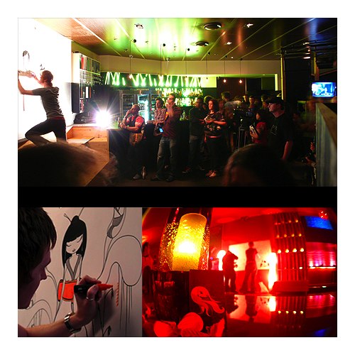
There really isn’t a “typical” day in the world of SKAFFS. It tends to be very chaotic. I start early and I finish late; I don’t ever stop thinking even when I go to sleep. I’m always working on something whether it is tight time frames for commissions, working on artwork for exhibitions, finishing up SKAFFS related projects or collaborating with companies to produce product lines. I do a lot of speaking engagements and live paintings so I am very fortunate to travel a lot. I’m also currently working on my own animation series. Having to oversee the production has been both challenging and exciting.
What will be new for SKAFFS in 2009?
2009 is going to be another busy but awesome year! I will be doing a lot of artist signings and live paintings to launch the limited edition book “Chaff n’ Skaffs: Mai and the Lost Moskivvy”. In 2008 I completed a music band CD slick and there is talk of appearing live at one of their music events (unfortunately I cannot disclose any further information at this time). I have numerous exhibitions in San Francisco and Los Angeles. And most importantly, I continue to develop my SKAFFS product line through collaborations with other progressive companies. In the next couple of months I will be launching a new line of giant vinyl adhesive artwork, some iphone apps and hopefully an animation by the end of the year!
What are your other interests beside art and design?
I tend to do a lot of traveling. With the long hours that I generally work (mostly in front of a computer) I try to balance it with some Taekwondo and when I have some spare time I also like to do skateboarding or blading.
Any advice to up and coming artists and designers?
My advice to aspiring designers would be to establish a style, practice, and stick with it. Experimenting with different mediums will help you to define who you are as an artist. And get involved in the local community and start exhibiting to get your work seen.
SKAFFS latest limited edition book “Chaff n Skaffs: Mai and the Lost Mozkivvy”
Mai is a young girl who never ventured too far from her home. When a lost mosquito interrupts Mai’s sleep, her friend Chaff suggests they escort Moskivvy back home to a faraway land. So begins a courageous girl’s voyage into a fantastic world that will kindle readers’ imaginations. Encountering whimsical creatures along the way, this trio must travel over land, sea, and sky.
Desktop Magazine describe Chaff n’ Skaffs: Mai and the lost Moskivvy as “the perfect conduit for Feldman’s imagination combining his waif like lasses and charming characters with the beautiful, yet unpredictable realm that is the unique Australian environment.” Discover a world of visual delight that Flavorpill described as a “childlike wonder and crisp exaggerated colors” and a new brand of heroine!
“Feldman’s artwork blends the classic stylings of 1950s Disney with a modern design sensibility to create something both cutting edge and timeless.”
-Andrew Farago, Cartoon Art Museum, Gallery Manager
“Luke Feldman’s instantly recognizable ‘Skaffs’ creations comprise a heady mix of bright colors and razor sharp style mixed with an underlying, almost tangible naivety that make his illustrations easily identifiable in a world where originality is not as easy to find as you might think..”
-Jo Spurling, author and editor of Desktop magazine
“As you follow the adventures of these three intrepid voyageurs, you can’t help but fall in love with the dazzling hues, exotic animals and intriguing storyline that splash the pages of this book.”
– Rossella Frigerio, editor, Chic Today
What was the inspiration, style, highs and lows of working on this project etc.
I have been illustrating for children’s books for a few years now, working for various international publishing houses. It was always a passion of mine to get my very own book published. The Chaff n Skaffs series had been in the workings now for a few years. The characters, designs and storyline had been sketched out prior to meeting with San Francisco based publishers, Immedium . What I have enjoyed about working with Immedium is that they allowed me to have complete creative control. This meant I could use many Australian elements and lingo in the book and create each page as a finished piece of artwork for all to enjoy.
My use and choice of colour is extremely important and therefore there was a lot of communication between the printers and myself. Variations in print can occur between all print companies so I have become accustomed to being on top of the problems that can occur.
Publishing a book is definitely a long term project. You must be passionate about the concept to work on it for long periods of time. Find a good publisher, one that is supportive and in control of the printing and distribution.
When/where can we get a copy of your new book?
The book is available online at www.skaffs.com/chaff and worldwide at Borders, Barnes and Noble, Target, Amazon and many independent stores such as Villain Store and Robio in Melbourne, VIC. It ships in April 2009.
$15.95 USA, Children’s Picture Book ISBN: 1-59702-013-3 (ISBN 13: 978-159702-013-8) 10 x 9 3/4, 36 pages
www.skaffs.com
Skaffs on Facebook
Skaffs Myspace
