Love type?

6-o

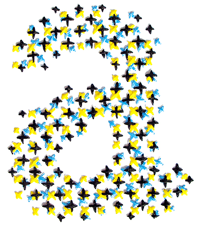
welovetypography.com is an awesome resource for typographic images and inspiration. New stuff is posted all the time, and you can search by colour, (as I did with yellow) as below. Rad.

Welovetypography is featuring a couple of Rosalie Gascoigne‘s works – anyone lucky enough to catch her exhibition earlier this year at Ian Potter at NGV (Melbourne) knows she is one talented lady.

If you are suffering from a bout of typeface-selection-block (note to self: think of more appropriate catch-phrase) then welovetypography should cure what ails ye.

Villa Dall’ava, Paris, France.

ava4cesto_451x329x90

Villa Dall’ava by Rem Koolhaas and The Office for Metropolitan Architecture (OMA) was completed way back in 1991. It was designed for a family of three with seperate ‘apartments’ one for the parents and one for their daughter. The client who wished for a swimming pool on their roof alse specifically requested full panoramic views (from their pool) of the surrounding landscape and city of Paris where the Villa is located.


The site is like a big room, with a boundary made of greenery, garden walls and slopes. It is composed of three parts: a sloping garden, the main volume of the villa, the street level garage with access in a cavity.
The house is conceived as a glass pavilion containing living and dining areas, with two hovering, perpendicular apartments shifted in opposite directions to exploit the view. They are joined by the swimming pool which rests on the concrete structure encased by the glass pavilion.

The Best Norwegian Electro group I have ever seen live…

845621224517447

Last Thursday I went to one of the best gigs I’ve been to in a long while, It was Datarock supported by Australian group Art Vs. Science.
In order for me to gloat about attending such an amazing gig ,on what is usally an art and design blog, I dug up some work by Norwegian photographer, Bent René Synnevåg who took these amazing shots of the band. (nice link, huh?)

Long story short, both Datarock and Art Vs. Science put on an amazing show, definitely worth seeing ! (Or checking out if you haven’t heard them yet!)


Typography work by Melbourne artist.

8561012280033931

Some work from Melbourne based designer Luke Lucas

Some interesting (and fun!) work to get you inspired. Particularly love Luke’s clever typography use of text.


You can see Luke Lucas’ blog on lifeLounge here

Printed Matter – Evelin Kasikov

frontpage

Evelin Kasikov is an Estonian-born, London-based designer who explores the boundary between craft and print by incorporating stitches into print works.


Having studied traditional printmaking techniques (intaglio, letterpress and lithography), Kasikov now works predominantly in editorial and book design (notably, for the ever-impressive Phaidon list).

Kasikov describes her latest project, Printed Matter, as ‘an investigation into the relationship between tactile and visual perception, seeing and touching.’

Duotone

Monotone

Printed Matter consists of ‘hand embroidery based on the analysis of optical mixture and colour printing processes.’ I love how the individual stitches represent CMYK, adding a tactile third dimension to print work.

Printed Matter

Printed Matter comprises four thematic books: Process, Element, Type and Image, which fit together to form a cohesive whole.

Process

Element

Type

Type

Image

Image

The trend of incorporating a handmade, crafted element into graphics is still going strong, but Kasikov’s work has a quiet, mature intricacy that transcends contemporary fashions.

Printed Matter

Mixing Work With Play – Creative Business Cards

cardapult

Although my focus as a contributor to Design Tavern is on Interior Architecture, I could not help but share these uber-innovative business card designs. Recently featured on Smashing Magazine.com, these creatives have found an innovative way to mix work and play.

This first design is by Bryce Bell who has devised a way to take the typical 2 x 3 business card layout and transform it into a business card catapult – also known as the “Cardapult”.  You can watch and learn how to make your very own version of the Cardapult here.

This second design is from the Columbus Society of Communicating Arts at cscarts.org.  Here the business cards directly translate into a traditional set of playing cards.

This third design is from Webstock at webstock.org.nz. Webstock hosts web-related events and conferences to promote the improvement of websites and social media through inspiration and education.  These creative business cards turn the bore of trading contact information with other professionals into an exciting game.  Each employee is worth a certain amount of points, the more you engage with others, the higher your score will be.

Synthesised 80s architecture Rap.. and the most educational video you will ever see.

321

When you look at a building reaching up to the sky there’s a lot more to building it than meets the eye!

ITS AR!..CHITECTURE! ITS ARCHITECTURE!

Had to share this one with you. If only my Construction and Structures lecturer had the same teaching methods as these kids.

Fed Square, Melbourne — Guest Post at Mochatini

federation square1010878

I was recently asked by Manvi to do a guest post on her blog Mochatini.

I chose to share with Mochatini’s readers a bit of my own city, Melbourne.

Specifically, the cultural hub ‘Fed Square’

See the original post here.