Hot Spot in Paris

testuser5_mar2009_01_lesociete_jp270309_xybp0g_tzpnyn1


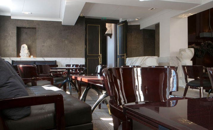
The French are often times described as being the most fashion-savvy people in the world.  As a result, it would be unlikely for a new, hip-restaurant in Paris to be a success without an equally fashionable interior and La Société accomplishes just that. The 130-seat restaurant located in a historic building across from the Saint Gemain church is owned by the famous Alex Denis and Jean-Louis Costes and was designed by Christian Liaigre.

]Liaigre gave the interior a classic modern , lounge-like feel by using rich, chocolate tones of mahogany and leather furniture in contrast with patina finish parquet floors, a marble champagne bar, and white sanded walls.  Contemporary art provides a unique addition to the interior with works by Peter Linderbgh, Sophie Lafont, Mathieu Lévy, Sara Favraiu, and Marc Rebollo.

La Société has already received much hype with famous guests such as Rachida Dati, Dolce & Gabbana, and the Fendi family and is currently featured in both Wallpaper and Vogue magazines.


“What are you doing right now?” The Status Calendar

42 statuscalendar3a

Twitter, Facebook, everyone’s asking the same thing now-a-days..

For some [myself included] it’s an addiction, when a social media asks “what are you doing right now?” One is compelled to answer —

Designers Burak Kaynak & Cem Has have taken the age old question and created the Status Calendar —

“The web’s big question ” What are you doing right now? ” is incredibly useful for tracking your daily activity.

This is a calendar where you can write your daily “status“.

It simply asks the question, “What are you doing Today?”

And you are invited to answer it!”

A fresh and clever Idea, maybe I’d be tempted to finally use a diary If It followed the same format of web social media.

Can’t wait to see it on the market one day.

Contemporary Jewish Museum – Daniel Libeskind

Contemporary Jewish Museum

Daniel Libeskind is an internationally renowned figure in the fields of architecture and urban design. An American architect of Polish-Jewish birth, Libeskind was originally a virtuoso performer before turning architect and receiving his degree in 1970.

Libeskind has dozends of completed works and many still under construction with projected completion over the next decade.. I wished to share an introduction to Libeskind’s work and philosophy with this example,
The contemporary Jewish Museum in San Francisco.

With the opening of its new building in June 2008, the Contemporary Jewish Museum (CJM) will usher in a new chapter in its 20-plus year history of engaging audiences and artists in exploring contemporary perspectives on Jewish culture, history, art and ideas. The new facility will be a lively center where people of all ages and backgrounds can gather to appreciate art, share diverse perspectives, and engage in hands-on activities.

“Inspired by the Hebrew phrase “l’chaim” (to life), the building is a physical embodiment of the CJM’s mission to bring together tradition and innovation in an exploration of the relevance of Jewish values and traditions in the 21st century.  The new 63,000-square-foot facility, located on Mission Street between 3rd & 4th Streets in downtown San Francisco, will enable the Museum to present an expanded array of engaging programming including art exhibitions, live music, film screenings, lectures and discussions, and educational activities for audiences of all ages and backgrounds.


The new addition to the Museum explodes out from inside the traditional building


Minimialsit interior, interesting use of light as well in this shot.

Fro Yo Craze

tangysweet_jul08_07

TangySweet – Washington D.C.

This past weekend I was walking around D.C and I passed the newest Tangy Sweet {a frozen yogurt shop} — which just opened up its second shop in Penn Quarter.  As I was studying the design of the front facade I decided that this would be a really fun post to develop, a look into the Interior Design of the frozen yogurt craze.  

An article from Wallpaper magazine recently showcased this same story line , called “Top frozen yoghurt bars”.  In this article the frozen yogurt craze is described as “a once-gaudy dessert which has traded in its Richard Simmons-type reputation for a stylish new look”.  This article featured the design of Frolick in Singapore, Myberry in Paris, Oko in New York, and Pinkberry in California. 

Sno: la Kyoto, Japan

Pinkberry, California

Oko, New York

Snog South Kensignton, London

Frolick, Singapore

And if you have not already decided to go hit up your local frozen yogurt shop to check out what this craze is all about then you probably will very soon – as it is becoming the new place to socialize and meet friends.  LA Times writer, Charlie Amter, also did a feature on the “frozen yogurt wars”  and said, “Fro-yo shops such as Pinkberry and Valley Village’s new Menchie’s are attracting crowds that previously hung out at Starbucks or the Coffee Bean & Tea Leaf. Actual “scenes” are developing at some locations — partially because of their interior design, as well as customers’ increasing appreciation for the health benefits of eating yogurt over, say, drinking a Frappuccino”.


Myberry, Paris

Creative Desks & Workspaces

desk-51

“It is almost necessary to make sure you love your workspace: because it is at your desk where your best work and ideas are born and developed.”

Well, can’t argue with logic like that! Check out the post here!

It’s always an ardous task when you go to sit down at your desk. In fact, these days just sitting down is half the battle when it comes to completing assignments or doing some work. For this very reason, you might as well make your work space an attractive one. Over at La Couturier, this is exactly what her latest post suggests you should do.

Fashion blogger and writer for DuJour mag,  ‘La Couturier’ knows her stuff. In this latest post, entitled My Space she gives you all the advice you need to revamp your work space and make it an inspiring and oh-so pretty one.

Images via weheartit.com

Universal connections — Objects between analogue and digital

14 lauschangriff

“..what is the difference between analogue and digital, physical and virtual? what connects and bridges these apparently different worlds?”
Dialog05 wished to expolore this question with their exhibit ‘universal connections.’ A question they say each member must address on a daily basis as an industrial designer, cerating consumer products.

The team decided to explore the subculture of the USB — Originally limited to only geeks, nerds and those in the industry, but now, is an every day item, bordering on low-tech, a technology that has been clearly understood and accepted by the general public.

“..something democratic evolves and develops and therefore often even receives a totally different usage than was originally intended.”

“this phenomena inspired us to use the USB interface, with all its possibilities and ambiguities as a medium for this project. we created installations, objects and products that are surprising, enlightening, inspiring and questioning, and on the other hand ironic or even amusing. “


the direct individual-data-connection for hearing, scanning and checking. any more secrets?


what are our essential needs? what do we really need for surviving?


not only for data junkies, also in the event of a virus. or simply for your daily data rations!


communication is spontaneous, direct, and works best between two individuals. is digital a serious alternative?

no access for unauthorized persons.

plastic, steel and glass. where should the data go? an icon regains its physical form


for the non-dialling generation, it’s a trip into the past – for those born earlier, it’s a trip down memory lane.


forgotten your password? the universal handle opens doors and gates.

a snapshot from summer, your favorite gig, your first time or your last flirtation. do you want to click through your memories or bury them?


http://www.dialog05.com/

EM2N Designs Updated Public Record Library

0720_008357cg-kopie

In Switzerland, public record offices and libraries are sometimes referred  to as “the brain of the community” because these library archives hold the country’s most valuable documents.  Architecture firm EM2N, based out of Zurich, renovated the Basel-Landschaft canton’s archival library this past year and the design is highlighted in the February issue of Metropolis.  

I found this article to be incredibly interesting because of how architects at EM2N were able to update the design of a ”typical’ underground library.  Important archives typically have been built underground in order to prevent the elements from weathering and destroying its valuable documents, but, EM2N was able to create an archive in a two-story building.  The design, which locates the archive in the center of the building while the office spaces line the perimeter, provides the necessary protection for the library while still making it open, airy, and fresh.

The black-steel staircase leads to the third floor, where the open library and exhibition space is centrally located and surrounded by beautiful views of the city landscape.

Another interesting fact is that this space also houses a bomb shelter -which is required by Swiss law to provide sufficient shelter space to protect each of its estimated 7.5 million citizens.

Letterbox

pro_blt_comnumb01

Melbourne graphic design studio Letterbox, under the direction of type king Stephen Banham, is reknowned for its incredibly strong typographic focus.


         Established in 1991, Letterbox undertakes typographic projects. Some of these are commissioned by clients (identity systems, signage systems, external publishing and font customisation) whilst others are initiated by the studio (such as lectures, publications, forums and exhibitions).”

Like many contemporary design studios, Letterbox folk have their sticky little fingers in many pies – including visual identities, book publishing, web design and so on – but in all of their projects type takes a strong focus, as seen in the new identity for the Melbourne Recital Centre. 


Some examples of Letterbox’s excellent work include this book jacket for one my favourite Australian novels in recent years – I love how the type chosen beautifully and subtly reflects the agricultural nature of the novel.


The Letterbox website also features typo-tours of Melbourne neighbourhoods – Melbourne, North Melbourne and Richmond. If you feel like strolling around North Melbourne on a sunny day and taking in some gorgeous typography, I strongly recommend following this tour, and be sure to stop by Auction Rooms for a coffee and check out their signage above the shopfront. 

I’d also stop by the Town Hall (the civic building, not the pub – although I’d happily stop in there too, let’s be honest) to see one of Letterbox’s projects, the Artshouse signage.


Letterbox also design their own fonts and these are for sale on their website – Greqsue and Berber are on my wishlist.


Letterbox is a truly amazing Melbourne studio with a body of work that manages to be incredibly diverse and yet employ a unified vision. Love, love, love their work!