Interview With Kate Bezar Creator of Dumbo Feather, Pass it on.

Well loved Dumbo Feather Library

Following my short article of Dumbo Feather, Pass it on, that i’d found at the Design Market
Comes an excerpt from the interview with Kate Bezar via theDesignfiles.net

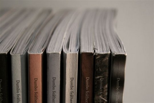
Well-loved Dumbo feather library

I get the feeling Kate Bezar is a bit of a dynamo.

It’s not just the incredible success she’s had with her stunning independent publication Dumbo feather in a fiercely competitive market….. (a magazine she started single-handedly five years ago and with no journalism experience, mind you). No, mainly, it’s the fact that just a few seconds of googling brings up so many varied accolades and creative collaborations that I begin to wonder if there might be 25 Kate Bezars.

But no, there’s only 1. And she’s here, here, here and even here.

And of course, she’s here! [thedesignfiles.net] Read on for an insight into the inspiring world of ‘editor, publisher & dreamer’, Kate Bezar. Thanks so much for your time Kate!”

Thedesignfiles: “Tell me a little about your background – what did you study and what path led you to what you’re doing now?”

“I’d almost bet I’m the first person with a Chemistry degree to grace your blog!

I think, like a lot of people, I never really knew what I wanted to be when I grew up. So, when I finished school, even though my best marks were in English and Painting, I thought the more sensible thing to do would be to study Commerce and Science. That lead me to a very sensible career as a management consultant working on projects for companies like banks and airlines, both of which I also used a lot; I flew ridiculous amounts and was paid ridiculously well. That was pretty seductive, but on some really fundamental level I knew it wasn’t what I was meant to be doing with my life, it wasn’t what I was passionate about.

I was volunteering at art galleries on weekends just to get my ‘fix’. Eventually I walked into a newsagent one night wanting to buy a mag but just couldn’t find what I wanted. I wanted to read about real people who’d found what they were passionate about in life and how they’d gone about pursuing it. When I walked out of that newsagent and I hadn’t found a mag but I had found what I was going to do. I was going to make a mag for people like me.”


See the rest of the interview here! at Lucy’s blog thedesignfiles.net

Vector Architecture – Green Technology Showroom

It jumped out at me because it is very much like my last assignment (post on it’s way)
I also wished to incorporate these grassy type walls – It’s great to see it in practice.

It’s funny, i had no idea this project existed though you’ll see some direct link with mine.  

Although green in a literal sense, the use of rammed earth and grass on the walls also has it’s own advantages, on top of a creating an interesting visual aesthetic.       

The advantages:
1. Reduce the heat gain and loss and enhance the thermal efficiency.
2. The grass panels will reduce storm water runoff.
3. Although the central lawn is taken away to make room for this building, but we effectively tripled the original planting area by using the grass panels on the roof and two facades.
4. Grass wall panel is planned to be relocated onto the partial fence of the residential compound after demolition.
5. Visually harmonize the temporary structure with the existing garden and the so called “Classic Spanish” Style 


Architect: Vector Architecture
Location: Beijing, China
Project Year: 2008
Client: CR Land
Design Partner in Charge: Gong Dong
Managing Partner in Charge: Hongyu Zhang
Project Architect: Shuo Li
Site Area: 500 sqm
Photographs: Vector Architecture


Design Concept:

The project is a “temporary” Green Technology Showroom of 3-year use for one of CR Land’s (华润置地) residential projects in Beijing. The idea is to develop the concept of “Temporary” from a meaningful perspective, to design a piece of floating “installation” in the garden, which could be built, demolished, and recycled through an easy and straightforward way with the least impact to the planned site.

Sustainable Features:

Site Selection

We are involved into the project at early stage when client tried to specify the building footprint within the residential compound. The location was finalized at the central lawn, where we believe in that:

1. the minimal impact of the designed landscape construction
2. the minimal impact of planned pedestrian circulation
3. Easy Demolition and Site recovery after use

Structure System Selection

We used the steel structure as the main structural system of the building, therefore,

1. The structural member can be reused after building is eventually taken down.
2. Overlap the structural member factory fabrication time with the site excavation, thus minimizing the construction schedule.
3. The building is elevated, greatly reducing the excavation and foundation work, thus allowing easy demolition and site recovery after use
Building Envelope: Vertical Grass Wall Paneling system and Green Roof

We apply the vertical grass panel system and green roof onto the building envelop,

(via)

MUJI Awards 03

I first came across MUJI via Jase Cooper’s blog so decided to do a bit of research and see what all of the fuss is about.

What Is MUJI?
Founded in 1980 MUJI is a Japanese company,  which sells a wide variety of home wares and consumer goods.

But under the surface..
MUJI’s is known for conservation of natural resources, low prices, simplicity, anonymity and an orientation toward nature. We embrace all of these attributes without placing disproportionate emphasis on any of them”

MUJI’s ideology on products and their production..

MUJI strives to base its design on the nature of the material making up a product..We simplify our process to elimiate waste entirely, but we carefully select and incorporate quality materials and processing technologies. Put simply, we create quality at low cost for smart purchases.”

Now famous for it’s deep underlying philosophy on living and consuming, MUJI has made it’s way from Japan to all over Asia, UK, Europe and North America.
Details »

Matt Huynh – Illustrator and visual aritst

845211224398882.jpg

I’m very happy to finally present to you some Aussie talent, we’ve gone far too long without a little creative input from home.

“Huynh’s experimental graphic novels span a diverse variety of genres from surrealist fantasy to polemical essays, dramas and autobiography. His inky, energetic brushwork has appeared on everything from magazines and prints to clothing, accessories, health resources, tattoos, film, performance projections, vinyl toys and dolls. When he’s not at the drawing table, he can be found conducting instructional workshops, public presentations, exhibitions and live art demonstrations as a member of Popperbox artists’ collective.”
(via Matt Huynh Bio) 

Midnight Morning is a limited and handcrafted publication combining the distinct work of Haline Ly, Matt Huynh and Will Loeng in a new and never-before-seen illustration series celebrating shared experiences of love and devastation.

Matt Huynh is a self taught Sydney based comic creator and illustrator; already an old hand at all in the field of visual arts, from editorial work to advertising, visualising to toys, tattoos, to publishing and graphic novels. You name it, Matt’s done it. Huynh’s work is imaginative and emotive but clearly expressed through his fine detail and a clever use of colour, dull or vibrant where appropriate

Details »

Concrete Tube Pendant Light by Wever & Ducré

wever_ducre_ct_1108

Belgian architectural lighting manufacturer Wever & Ducré have a new pendant light.

From Wever & Ducré:

The Concrete Tube by Belgian designer Wall-y catches the eye immediately with its concrete look. It fits in perfectly with our quest for new materials and our love and respect for concrete. It should be said: this material is very hard to make, yet the result is magnificent. This hanging lamp gets its teeth into the room, as it were, and scores high on ‘cuddliness’. The Concrete Tube is ideal for minimalist homes, loft-style apartments, restaurants and offices.

Visit the website of Wever & Ducré – here.
via contemporist

I’m a bit of a concrete fanatic – and absolutely swooned when I saw this!
I love the industrial feel – and the fact that it isn’t a perfect finish on the cylinder just adds to its rough aesthetics – A lovely feature to any brutalist home or office :)

Igor Pinigin – Product Designer

igor.jpg

Anemona is the brainchild of Ukrainian Industrial designer Igor Pinigin –

Anemona The unbalanced, visually unstable lamp creates an amazing lighting solution – limitless in terms of configuration and mobility. The fact that each lamp in itself is a separate entity is well thought out, free from messy wires, users are given full freedom of how they set up their own lighting, and can be constantly changed.

[slideshow=14,400,400]

Igor has kindly described for Design Tavern his idea of the ‘visually unstable lamp’

I am glad to present you ANEMONA – visually unstable lamp.
The main idea behind this concept is that the lamp is able to change its position, this complete mobility creates a visually unstable effect. The equilibrium position of this lamp is produced through the shape, construction and also the presence of heavy glass balls that fill the bottom of the lamp – the full mobility of Anemona allows for the assembly of dynamic figures. The prototype was produced especially for exposition at SaloneSatellite Moscow 2008 and was presented as a mobile wireless lamp with LEDs powered by accumulators located inside. The shape of prototype looks different from planed original and will be continually be changed from its original shape, adding to the unstable concept.

check out Igor’s work here
Or his personal blog (ukrainian ) here

Alexander Ovchinnikov – Digital Artist/Photographer


Born and raised in Moscow, Russia, Alexander Ovchinnikov – The well travelled artist, photographer, t-shirt designer and all round creative being has travelled the world and documented his findings along the way..

part of which have been filed into a folio he calls the ‘Black Album’

[slideshow=12,400,400]

For the Black Album  I used the pictures of  people taken in the streets of different cities such as: Moscow, Rome, London, Capetown, Brisbane etc. (I like to turn ordinary photos into the conceptual pictures about life, death and the other magic).   I shot and turned into Photoshop Brushes a lot of objects and textures , further retouching and composing were done in Adobe Photoshop as well.”

Alexander has worked as a TV animation/motion designer, magazine art director and free-lance designer, he offers that he was lucky to see the revival of design, TV and magazines in Russia after the Soviet time.

Alexander is now the creative director and co-owner of MILK creative agency, and are working hard on a T-shirt design series that will be availble for sale soon.

[slideshow=13,400,400]

to aspiring designers alexander offers this..

“Don’t be afraid of anything. More impudence and freedom in creation. The more you’ll try the better the result is.”

A huge thanks to Alexander Ovchinnikov for allowing us to show his impressive work, and best of luck getting your t-shirts out there on the streets!

To see Alexander’s other creative work please visit:
http://www.behance.net/AlexanderOvchinnikov

http://www.not-for-sale.ru/

Space Invaders Design Group

From Milano, Italy comes the talented talent of the Space Invaders Design Group.

Fresh from University, these talented young designers have now completed their degrees but are still meeting to enter design competitions.

The team have kindly given Design Tavern a taste of their work –  A few past University projects.

"Monolite was our final university effort.. "

Tell us a little about yourselves, where are you from and where are you living now?

Four people make up Space Invaders and we are each from a different part of Italy. We met in Milano at university and discovered that working together could have been some potential so we gave it a go and we created the group.

The Space Invaders group is composed by Giovanni Mendini, Stefano Pertegato, Francesco Schiraldi and Eloisa tolu.

The project was for a lighting system which can become something more than a simple lamp, and is actually an “interactive architetural element” to fit in with the SOHO housings (office houses in which dwellers live their entire day).

Details »